- Video Showcase
- Description:
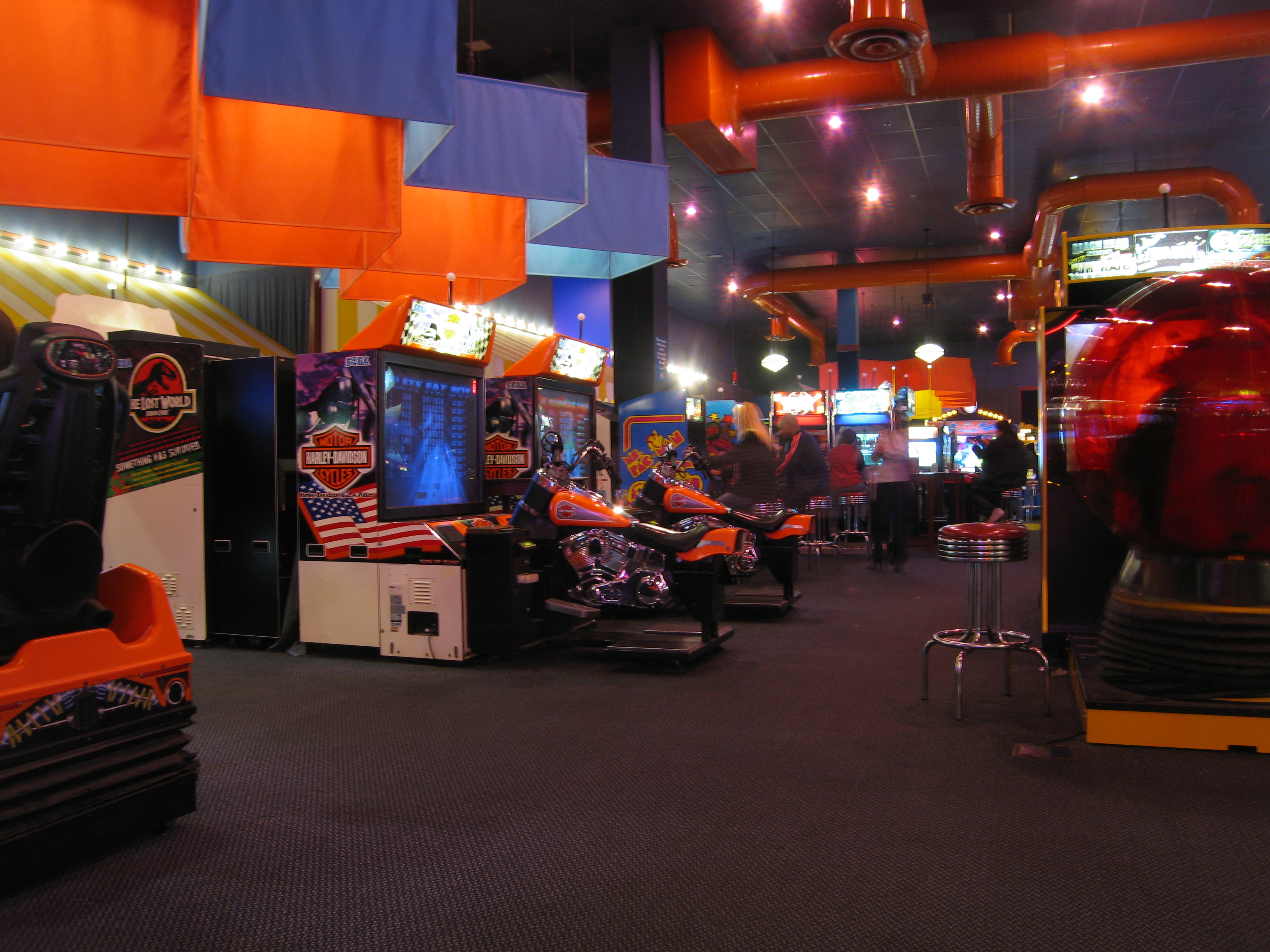
A brochure for my arcade company Attract Mode.
- Process (Programs, Tools, Skills):
I actually really enjoyed this project. I knew I wanted to continue with the theme that I’ve been working on for most of the semester and decided to do it for Attract Mode. I started off by searching for pictures that would display the kind of arcade atmosphere I was after. After that I had to find the perfect background. I’m also really fond of the fonts I used. They really evoke an old school feel. The toughest part was clipping the arcade cabinet in the bottom left corner.
- Message:
I was trying to get across that no matter who you are or what kind of arcade experience you’re seeking, you could find it at Attract Mode.
- Audience:
Arcade fans young and old. Seasoned vets and newcomers alike.
- Top Thing Learned:
How to effectively clip an image. Tough stuff.
- Color scheme and color names:
There are way too many colors going on here to nail it down to just a single color scheme.
- Title Font Name & Category:
pokemonGB – decorative.
- Copy Font Name & Category:
earthmomma – decoravtive.
- Word Count:
284
- Thumbnails of Images used:


- Sources (Links to images on original websites)
http://commons.wikimedia.org/wiki/File:Dave_%26_Buster’s_video_arcade_in_Columbus,_OH_-_17912.JPG
http://arstechnica.com/gaming/2013/09/the-gaijin-gamers-guide-to-tokyos-thriving-arcades/
http://ispeakcomics.wordpress.com/2011/04/01/why-fighting-game-stories-lack-substance-round-1/

I love the design of your brochure. It really has a retro video game feel to it with the colors and fonts you chose. The message is clear with these choices. When I look at it even without the pictures I would think video/computer games. Well done.
Here is a link to mine if you want to check it out.
http://akdavid85.wordpress.com/2014/03/29/p8-brochure/